
Problem
As Quantum Fiber’s vast product offering, including software and equipment/network enhancement products, continued to grow, Quantum was no longer able to incorporate all offerings within the purchasing flow. Adding these additional product sets within the purchasing flows was causing customer confusion and a drop in new service conversion rates.
Solution
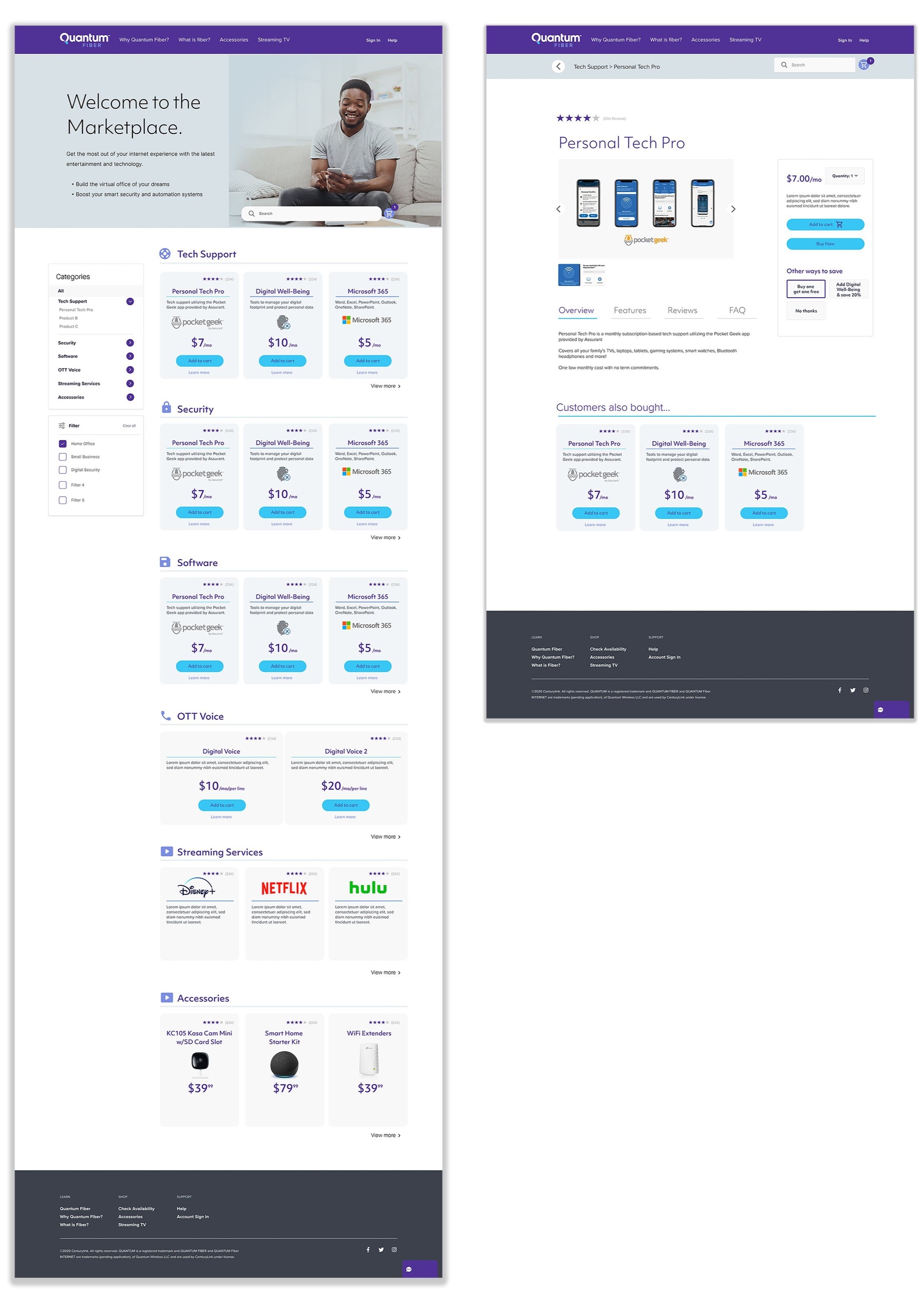
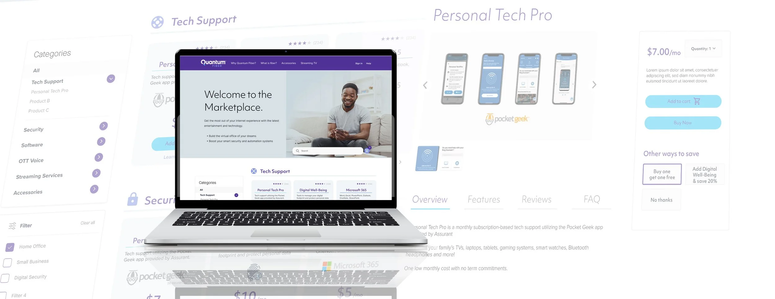
Create a “Marketplace” style site that Quantum could direct new and existing customers to enhance their current Quantum Fiber Internet subscription.
My Role
Lead UX/UI Designer, Information Architecture, User Research, Interface Design, Prototyping & Testing
Research & Discovery
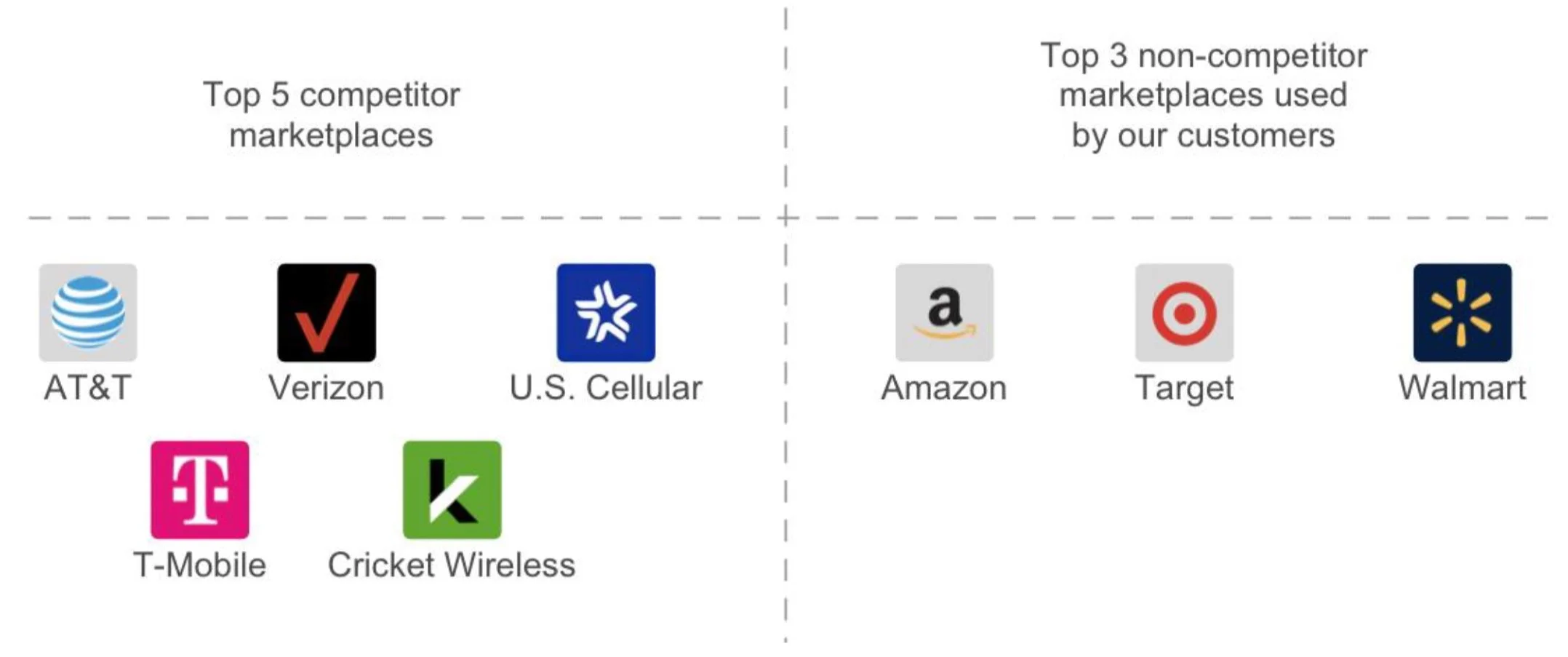
Key questions we looked to answer with our competitive research:
What are the top 5 marketplaces by our competition?
What are the top 3 marketplaces used by our customers?
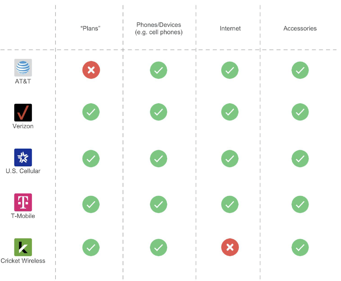
What are the top traits/features that these marketplaces have in common?
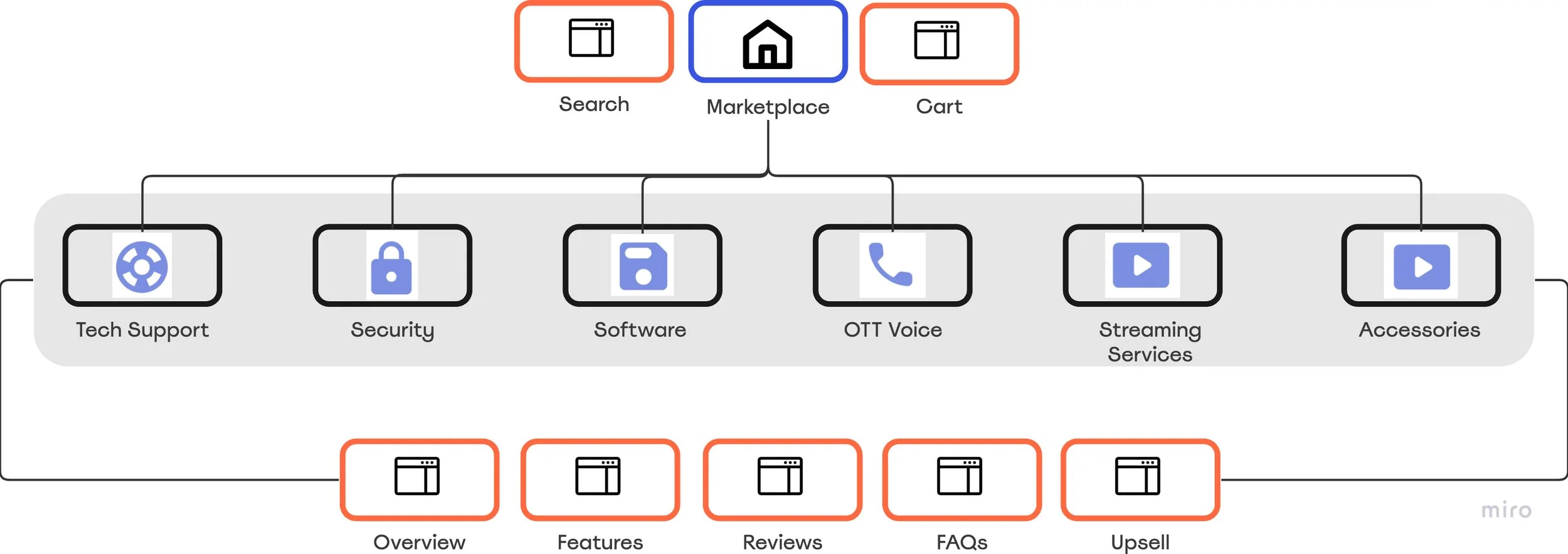
Overview
Final Design
The following Marketplace common key features were used to guide the final design:
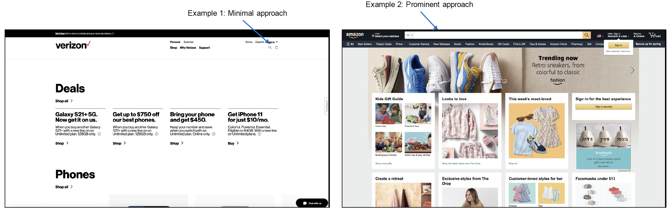
Search: All display search in some way. The more products within the marketplace, the more prominently search is displayed.
Categories: All provide the ability to view the product category options within the navigation.
Product Pricing: All display prices at the product level (some display a ‘starting at’ price).
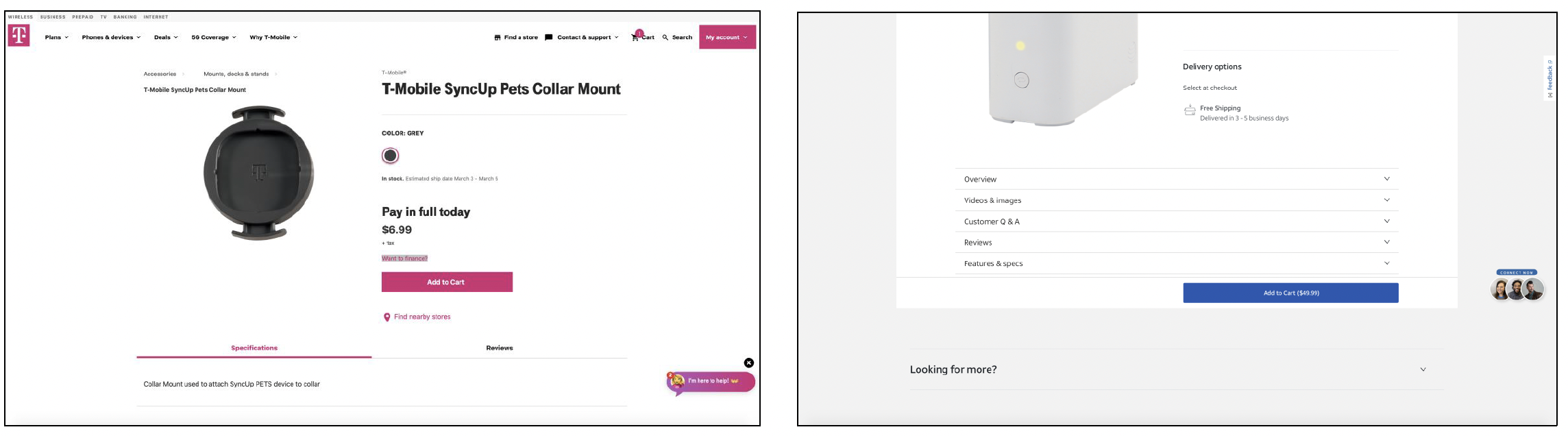
Product Pages: All displayed products that, when clicked, have separate product-pages.
⎻All display an overview, description, or specifications section on the product page.Filters: All allowed the user to filter products
Carts: All had shopping carts located in the top right on desktop
(7 out of 8 were in the top right on mobile as well).Reviews: All display reviews for products.
Images: Each of the 3 non-competitor websites use dimagery for the product categories. However, the 5 competitor websites did NOT use imagery for the product categories.